Brand
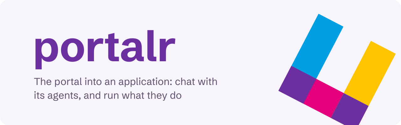
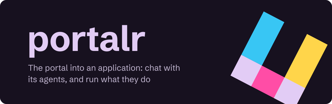
lattice ADR-0014 records portalr's identity. It prints in cyan, magenta and yellow together, the full-colour proof, and its mark is lattice's cell with one side open: a window onto the lattice every mark is drawn on, opened. Where two sides cross is its overprint, a violet, which is its working colour. The mark has two versions: app's opens to the upper right, outward, and admin's to the lower left. tokens.json holds its colours, and ui's tokens.css holds them as CSS custom properties: the inks as --portalr-*, and the roles the components use, such as --accent and --focus, under brand-neutral names.


| File | What it is | Use it on |
|---|---|---|
mark-light.svg |
The mark, app's version |
Light backgrounds |
mark-dark.svg |
The mark, app's version |
Dark backgrounds |
mark-admin-light.svg |
The mark, admin's version |
Light backgrounds |
mark-admin-dark.svg |
The mark, admin's version |
Dark backgrounds |
lockup-light.svg |
The mark and the wordmark | Light backgrounds |
lockup-dark.svg |
The mark and the wordmark | Dark backgrounds |
banner-light.svg |
The README banner | Light backgrounds |
banner-dark.svg |
The README banner | Dark backgrounds |
favicon.svg |
app's mark, switching to the dark colours when the system prefers a dark scheme |
app's browser tabs |
favicon-admin.svg |
admin's mark, switching the same way |
admin's browser tabs |






Colours
| Name | Light | Dark | Role |
|---|---|---|---|
| Cyan | #009FE3 |
#38C6F4 |
The upper-left side; the UIs' focus ring on dark backgrounds |
| Magenta | #E4007C |
#FF4DA6 |
The lower-left side in app's mark, the upper-right in admin's |
| Yellow | #FFC400 |
#FFD54A |
The lower-right side. Never text |
| Violet | #6B2FA0 |
#E2CCF5 |
The overprint, where two sides cross; the wordmark; the UIs' working colour, for actions and links, and their focus ring on light backgrounds, where cyan is too light (2.73:1 on the paper) |
| Paper | #F7F4FB |
#17111F |
The banner's background, and the UIs' paper |
| Graphite | #5E5470 |
#BDB2CC |
Secondary text, such as the banner's tagline |
Violet is 8.27:1 on white and 12.06:1 on the site's dark background, #0D1920; graphite is 6.48:1 and 9.16:1 on the papers.
Known weaknesses
- It reads as lattice's child, which suits the portal onto lattice. Three inks, an open side and violet overlaps keep it apart from lattice's one-ink, closed cell, but at 16 pixels it reads as a broken ring before it reads as a window.
- Its violet is a step from artifactr's indigo, lighter and redder, and the marks share no shape; in a tab strip the colours are close.
- Its open ends keep lattice's points rather than flat cuts.