Brand
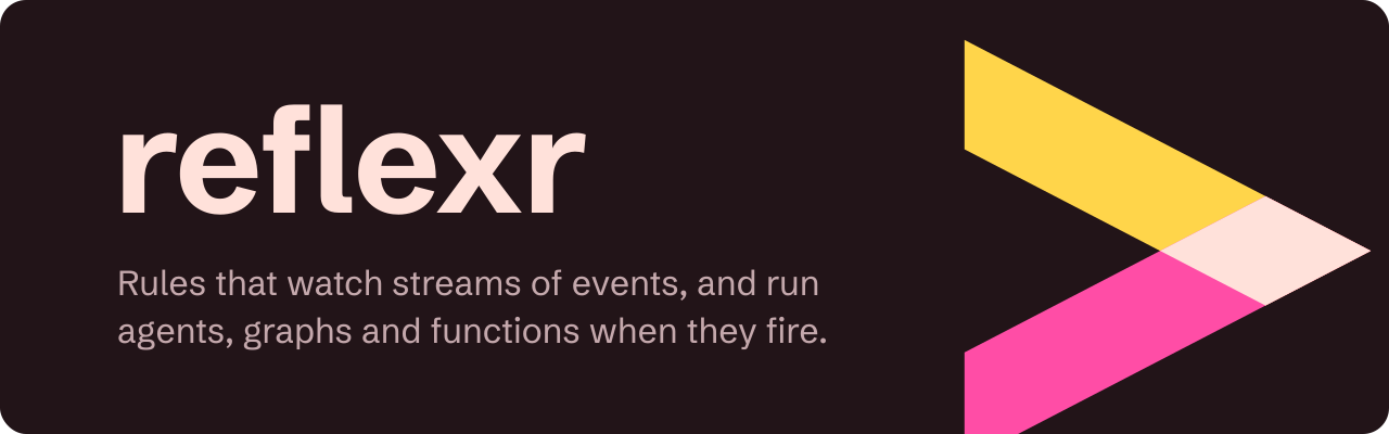
reflexr's identity is a sibling of artifactr's, and comes from the same place: print proofing. Two inks, yellow and magenta, are the two halves of a reflex: the event that arrives and the response that leaves. Where both inks land on the same spot they overprint into a third colour, a deep red, which stands for the moment between them: the rule firing. The mark is artifactr's caret turned a quarter, a chevron. An event comes in along the upper stroke and the response goes back out along the lower one, and at the point, where the two meet, the rule fires. It also reads as "then", the second half of every rule.


Files
Every file is a hand-authored SVG with no embedded images or fonts. Text is outlined, so nothing depends on the viewer's fonts.
| File | What it is | Use it on |
|---|---|---|
mark-light.svg |
The mark | Light backgrounds |
mark-dark.svg |
The mark, with a light overprint | Dark backgrounds |
lockup-light.svg |
The mark and the wordmark | Light backgrounds |
lockup-dark.svg |
The mark and the wordmark | Dark backgrounds |
banner-light.svg |
The README banner, 1280 × 400 | Light backgrounds |
banner-dark.svg |
The README banner, 1280 × 400 | Dark backgrounds |
favicon.svg |
The mark, switching to the dark colours when the system prefers a dark scheme | Browser tabs |
family-light.svg |
The four marks of the family, over their names | Light backgrounds |
family-dark.svg |
The four marks of the family, over their names | Dark backgrounds |








Colours
| Name | Light | Dark | Role |
|---|---|---|---|
| Yellow | #FFC400 |
#FFD54A |
The event: the upper stroke of the mark. Highlighted lines of code on the site. |
| Magenta | #E4007C |
#FF4DA6 |
The response: the lower stroke of the mark. The site's interactive accent (#C2006A on light backgrounds, for contrast with text). |
| Overprint | #B3122E |
#FFE1DA |
The rule firing: the mark's point, the wordmark, and the site's primary colour for headings and links (#FF9D93 for links on dark backgrounds). |
| Paper | #FAF6F3 |
#221418 |
Backgrounds of the banner. The site's dark scheme uses #1F1317. |
| Graphite | #6E5055 |
#C4A8AC |
Secondary text, such as the banner's tagline. |
On paper, overlapping inks make a darker colour, so the light overprint is a deep red. On screen, overlapping light makes a lighter one, so on dark backgrounds the overprint is a pale rose. Keep that logic when drawing new material in the brand's colours. Every colour used for text has a contrast of at least 4.5:1 against the background it is used on.
Type
| Typeface | Role | Why |
|---|---|---|
| Schibsted Grotesk | The wordmark (Bold, outlined, tracked 1.2% tight), headings and body text on the site | artifactr's face, so the family reads as one: a plain, readable grotesque with an editorial voice |
| Fragment Mono | Code on the site | A monospace in the Helvetica tradition, so code sits comfortably beside the grotesque |
Both are open-source (SIL Open Font License) and served by Google Fonts. The wordmark is always lowercase: reflexr.
Using the brand
- Use the light files on light backgrounds and the dark files on dark ones; don't recolour them.
- Keep clear space around the mark of at least a quarter of its height.
- The mark stays legible down to 16 pixels. Below 24 pixels, use it without the wordmark.
- Yellow and magenta stand for the event and the response, so don't use them as decoration. Outside the mark, magenta only marks interaction on the site (a hovered link, the current page), yellow only highlights code, and the overprint red is the working colour for everything else.
- Never set text in yellow: it is too light on paper.
- Don't stretch, rotate, outline or add effects to the mark, and don't set the wordmark in another typeface.
- In a README, switch between the light and dark banners with a
<picture>element, as the repository's README does.
The family
artifactr, reflexr, evalr and stackr share one brand system, so that they read as a family wherever they appear together: a README that links its siblings, a stack that runs them all, a system built from them.
The system
- The inks are a printer's: cyan, magenta, yellow and key. Each coloured library prints with two of the three process inks and names its own meaning for each, and where they overlap they overprint into a third colour: the library's working colour. Any two of the coloured libraries share one ink, as neighbouring jobs on a press share a plate. stackr prints in key.
- One grid. Every mark is drawn on a 64-unit square and sits in the same place on it in every file, so one mark can replace another without re-spacing a layout.
- One stroke. A stroke is a band 14 units wide, measured horizontally, on artifactr's diagonal of 27 across for every 52 down (about 62.6°). Strokes end in flat cuts along the grid, and meet in points where one stroke's edge cuts the other.
- One overprint. A mark's overlaps, and only those, are filled with its overprint colour. On paper the overprint is darker than both inks, and on screen lighter.
- One typographic layout. The wordmark is Schibsted Grotesk Bold, lowercase, outlined and tracked 1.2% tight. In a lockup it is set at 64 units, with the mark's grid scaled so that 52 grid units (from line 6 to line 58, the height of artifactr's caret) are 0.8 of the type size, line 58 on the baseline, 0.16 of the type size between the mark and the word, and 8 units of padding. A banner is 1280 × 400 with 24-unit corners: the wordmark at 136 units (baseline 196, from x = 104), a two-line tagline in the same face at weight 420 and 32 units (baselines 272 and 316, from x = 108) in the graphite, and the mark at 7.2 times its grid from (845.6, 0.8), running off the panel.
- One site palette rule. The overprint is the working colour (headings, links, the primary colour), the darker ink marks interaction, and the lighter ink highlights code. The dark scheme's background is a near-black of the overprint's hue.
The siblings
| Library | Mark | Inks | Overprint | What the mark says |
|---|---|---|---|---|
| artifactr | A caret, ^ |
Magenta and cyan: a person and an agent | Indigo #2D2A8C: the artifact they share |
The proofreader's sign for "insert here", and the letter A |
| reflexr | A chevron, >: the caret turned a quarter |
Yellow and magenta: an event and a response | Red #B3122E: the rule firing |
A reflex, a signal in and bent back out; and "then" |
| evalr | A tick: the caret turned over, one arm cut short at two thirds of its height | Yellow and cyan: a person's judgement and an evaluator's | Green #00704F: the verdict where they agree |
A verdict; its arms meet in a point, as the caret's do |
| stackr | Three slabs, stacked along the family's diagonal, their ends cut at its angle | Key: one tint for every layer | Key #1C1D26, where two layers overlap |
The layers the other libraries run on, and the key plate the others are printed in register to |
evalr's and stackr's files are drawn to these rules and join their own repositories with their sites.
stackr's alternative, drawn and set aside, stacks the three process inks instead: cyan, magenta and yellow slabs, overprinting into artifactr's indigo and reflexr's red where they meet. It says "the family's stack" more literally and gives stackr colour, but it reads as a flag, and it borrows its siblings' overprints instead of having one of its own. The key version is preferred: infrastructure should be the quiet plate under the colour.
Known weaknesses
- The chevron reads as "play" or "next" to some eyes, and in front of the wordmark it looks like a shell prompt. The family accepts this, as artifactr's caret also reads as "up", and for a library whose rules end in "then run this" the connotation is not wrong.
- Yellow is the weakest ink on paper. It holds at the size of the mark, and on dark backgrounds it is the strongest, but it must never carry text or thin lines.
- Magenta is shared with artifactr. Side by side, the shapes and overprints tell the two apart, but in a browser's tab strip at 16 pixels they are the closest pair in the family.
- stackr is the least distinctive. Three horizontal bars can read as a menu icon, and without a hue its links need underlines to be told apart from body text.